Temperatures in Melbourne - historical data
Use this links to download the data:
For max temp: http://www.bom.gov.au/climate/change/hqsites/data/temp/tmax.086338.daily.csv
For min temp: http://www.bom.gov.au/climate/change/hqsites/data/temp/tmin.086338.daily.csv
- Plot daily temperatures
- Plot monthly temperature
- Plot yearly average temperature
- Predict the temperature rise for the next 500 years
- Prediction using SARIMAX
- Days over 35 °C
Plot daily temperatures
Here is the attempt to plot the daily max and min temperature. The plot looks very crowded: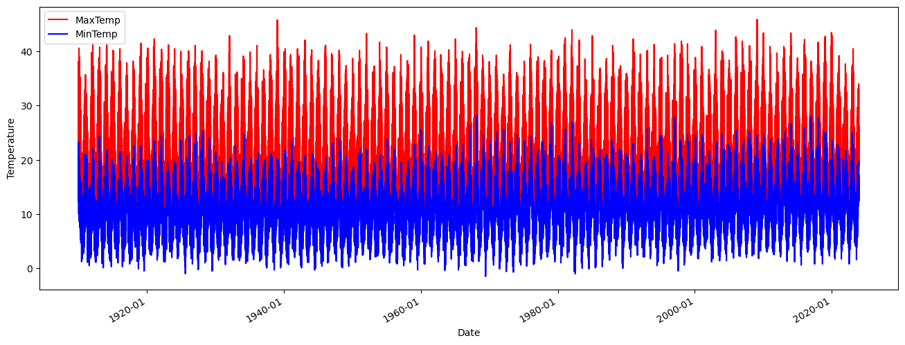
Here is the code that generate it:
import pandas as pd
import matplotlib.pyplot as plt
import matplotlib.dates as mdates

df_max = pd.read_csv('tmax.csv')
df_min = pd.read_csv('tmin.csv')

df_max['Date'] = pd.to_datetime(df_max['Date'], dayfirst=True).dt.to_period('D')
df_min['Date'] = pd.to_datetime(df_min['Date'], dayfirst=True).dt.to_period('D')

# Reset the index
df_max = df_max.reset_index()
df_min = df_min.reset_index()

# Convert Period to datetime
df_max['Date'] = df_max['Date'].dt.to_timestamp()
df_min['Date'] = df_min['Date'].dt.to_timestamp()

# Plotting
plt.figure(figsize=(16,6))
plt.plot(df_max['Date'], df_max['t_max'], color='red', label='MaxTemp')
plt.plot(df_min['Date'], df_min['t_min'], color='blue', label='MinTemp')
plt.legend()
plt.xlabel('Date')
plt.ylabel('Temperature')
plt.gca().xaxis.set_major_formatter(mdates.DateFormatter('%Y-%m'))  # Format dates as 'YYYY-MM'
plt.gcf().autofmt_xdate()  # Slant dates for better readability
plt.show()
Plot monthly temperature
To clean the plot we compute monthly average: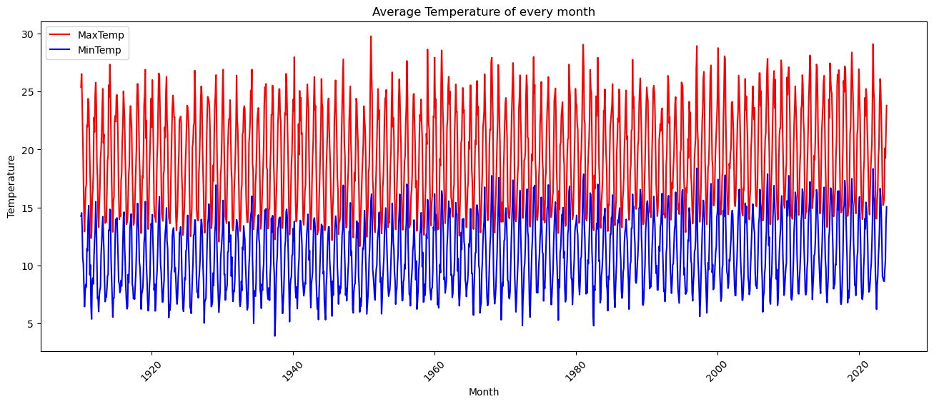
Generated by this code:
import matplotlib.pyplot as plt
import pandas as pd

df_max = pd.read_csv('tmax.csv')
df_min = pd.read_csv('tmin.csv')

# Assuming df_max and df_min are your DataFrames
df_max = df_max.reset_index()
df_min = df_min.reset_index()

# Convert 'Date' column to datetime
df_max['Date'] = pd.to_datetime(df_max['Date'], dayfirst=True)
df_min['Date'] = pd.to_datetime(df_min['Date'], dayfirst=True)

# Calculate average temperature of every month
df_max_month_avg = df_max.groupby(df_max['Date'].dt.to_period('M'))['t_max'].mean().reset_index()
df_min_month_avg = df_min.groupby(df_min['Date'].dt.to_period('M'))['t_min'].mean().reset_index()

# Rename columns
df_max_month_avg.columns = ['Month', 'Average Max Temperature']
df_min_month_avg.columns = ['Month', 'Average Min Temperature']

#Convert the 'Month' column to datetime objects:
df_max_month_avg['Month'] = df_max_month_avg['Month'].dt.to_timestamp()
df_min_month_avg['Month'] = df_min_month_avg['Month'].dt.to_timestamp()


# Plotting
plt.figure(figsize=(16,6))
plt.plot(df_max_month_avg['Month'], df_max_month_avg['Average Max Temperature'], color='red', label='MaxTemp')
plt.plot(df_min_month_avg['Month'], df_min_month_avg['Average Min Temperature'], color='blue', label='MinTemp')
plt.legend()
plt.xlabel('Month')
plt.ylabel('Temperature')
plt.title('Average Temperature of every month')
plt.xticks(rotation=45)
plt.show()
Plot yearly average temperature
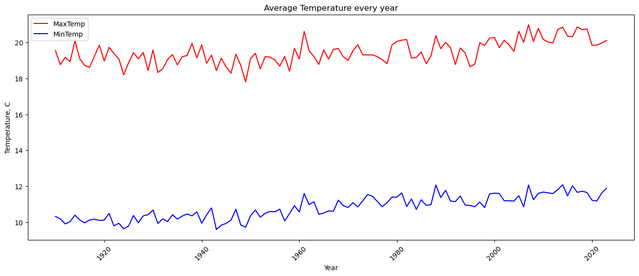
Here is the result, much cleaner and shows a small trend in temperature increase over 100 years by 2 degrees.
Here is the code to plot yearly average temperature:
import matplotlib.pyplot as plt
import pandas as pd

df_max = pd.read_csv('tmax.csv')
df_min = pd.read_csv('tmin.csv')

# Assuming df_max and df_min are your DataFrames
df_max = df_max.reset_index()
df_min = df_min.reset_index()

# Convert 'Date' column to datetime
df_max['Date'] = pd.to_datetime(df_max['Date'], dayfirst=True)
df_min['Date'] = pd.to_datetime(df_min['Date'], dayfirst=True)

# Calculate average temperature every year
df_max_year_avg = df_max.groupby(df_max['Date'].dt.year)['t_max'].mean().reset_index()
df_min_year_avg = df_min.groupby(df_min['Date'].dt.year)['t_min'].mean().reset_index()

# Rename columns
df_max_year_avg.columns = ['Year', 'Average Max Temperature']
df_min_year_avg.columns = ['Year', 'Average Min Temperature']

# Plotting
plt.figure(figsize=(16,6))
plt.plot(df_max_year_avg['Year'], df_max_year_avg['Average Max Temperature'], color='red', label='MaxTemp')
plt.plot(df_min_year_avg['Year'], df_min_year_avg['Average Min Temperature'], color='blue', label='MinTemp')
plt.legend()
plt.xlabel('Year')
plt.ylabel('Temperature, C')
plt.title('Average Temperature every year')
plt.xticks(rotation=45)
plt.show()
Predict the temperature rise for the next 500 years
Using a linear interpolation here is the trend in temperature increase.

Interesting to see that the max temperatures will increase from around 20C to 23 in 500 years whereas the minimum temperatures have a steeper trend going from 11C to 19C for the same period of time. There will be hotter nights but days will remain almost the same.
Here is the code:
import matplotlib.pyplot as plt
import pandas as pd
import numpy as np

df_max = pd.read_csv('tmax.csv')
df_min = pd.read_csv('tmin.csv')

# Assuming df_max and df_min are your DataFrames
df_max = df_max.reset_index()
df_min = df_min.reset_index()

# Convert 'Date' column to datetime
df_max['Date'] = pd.to_datetime(df_max['Date'], dayfirst=True)
df_min['Date'] = pd.to_datetime(df_min['Date'], dayfirst=True)

# Calculate average temperature every year
df_max_year_avg = df_max.groupby(df_max['Date'].dt.year)['t_max'].mean().reset_index()
df_min_year_avg = df_min.groupby(df_min['Date'].dt.year)['t_min'].mean().reset_index()

# Rename columns
df_max_year_avg.columns = ['Year', 'Average Max Temperature']
df_min_year_avg.columns = ['Year', 'Average Min Temperature']

# Calculate slope and intercept of temperature trend
slope_max = (df_max_year_avg['Average Max Temperature'].iloc[-1] - df_max_year_avg['Average Max Temperature'].iloc[0]) / (df_max_year_avg['Year'].iloc[-1] - df_max_year_avg['Year'].iloc[0])
intercept_max = df_max_year_avg['Average Max Temperature'].iloc[0] - slope_max * df_max_year_avg['Year'].iloc[0]

slope_min = (df_min_year_avg['Average Min Temperature'].iloc[-1] - df_min_year_avg['Average Min Temperature'].iloc[0]) / (df_min_year_avg['Year'].iloc[-1] - df_min_year_avg['Year'].iloc[0])
intercept_min = df_min_year_avg['Average Min Temperature'].iloc[0] - slope_min * df_min_year_avg['Year'].iloc[0]

# Extrapolate temperature trend for next 500 years
years_future = np.arange(df_max_year_avg['Year'].iloc[-1] + 1, df_max_year_avg['Year'].iloc[-1] + 501)
temp_max_future = slope_max * years_future + intercept_max
temp_min_future = slope_min * years_future + intercept_min

# Plotting
plt.figure(figsize=(16,6))
plt.plot(df_max_year_avg['Year'], df_max_year_avg['Average Max Temperature'], color='red', label='MaxTemp')
plt.plot(df_min_year_avg['Year'], df_min_year_avg['Average Min Temperature'], color='blue', label='MinTemp')
plt.plot(years_future, temp_max_future, color='red', linestyle='--', label='MaxTemp Future')
plt.plot(years_future, temp_min_future, color='blue', linestyle='--', label='MinTemp Future')
plt.legend()
plt.xlabel('Year')
plt.ylabel('Temperature, C')
plt.grid(axis='y', linestyle='--', linewidth=0.5)
plt.title('Average Temperature every year')
plt.xticks(rotation=45)
plt.show()
Prediction using SARIMAX
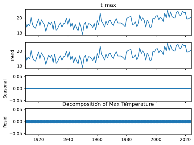
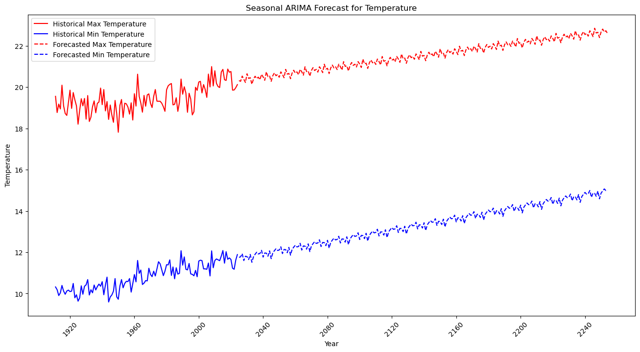
It is interesting to come across this SARIMAX prediction model suggested by Ollama model qwen2.5:13b.
Here is the prediction for the existing maximum temperatures.
And here we have the predicted minimum temperatures.
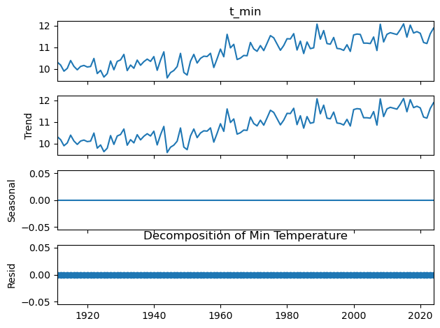
It seems pretty accurate.
And the prediction for the next 240 years. The model can't take date beyond 2240.
Days over 35 °C
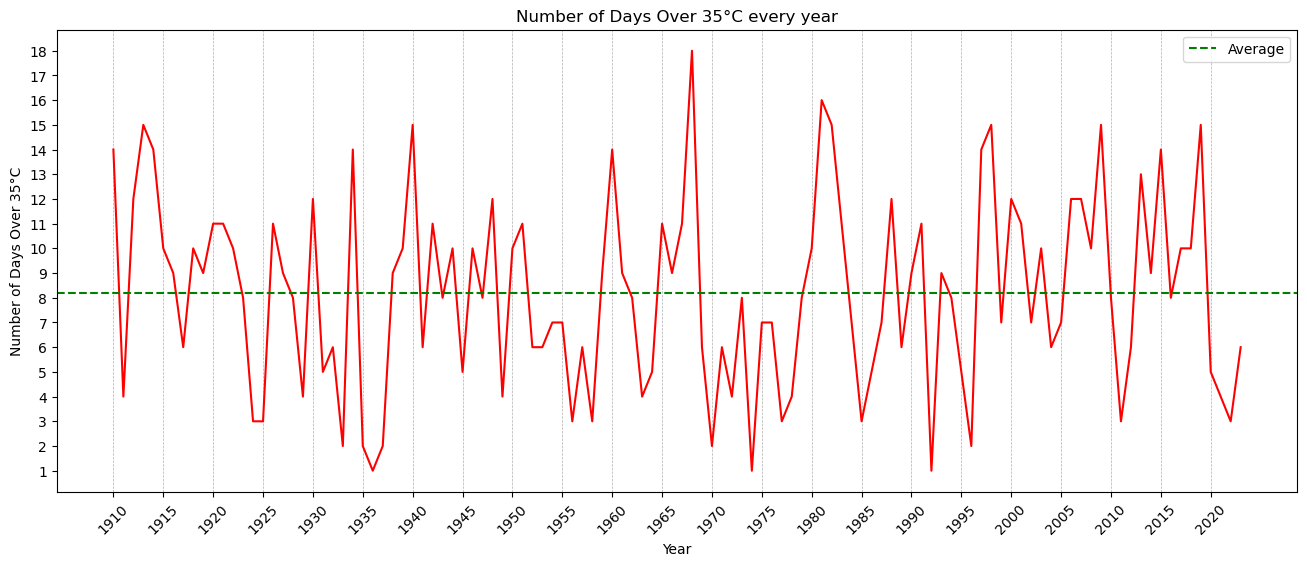
Interesting to see how many days are over 35 C. It seems that between 1995 and 2020 we got more days over 35C than before.
And here is the code:
import matplotlib.pyplot as plt
import pandas as pd
import matplotlib.ticker as ticker

df_max = pd.read_csv('tmax.csv')
#df_min = pd.read_csv('tmin.csv')

# Assuming df is your DataFrame
df = df_max.reset_index()

# Convert 'Date' column to datetime
df['Date'] = pd.to_datetime(df['Date'], dayfirst=True)

# Calculate number of days over 35°C temperature every year
df_over_35 = df[df['t_max'] > 35]
df_over_35_year = df_over_35.groupby(df_over_35['Date'].dt.year)['t_max'].count().reset_index()

# Rename columns
df_over_35_year.columns = ['Year', 'Number of Days Over 35°C']

# Calculate average
average = df_over_35_year['Number of Days Over 35°C'].mean()

# Plotting
plt.figure(figsize=(16,6))
plt.plot(df_over_35_year['Year'], df_over_35_year['Number of Days Over 35°C'], color='red')
plt.xlabel('Year')
plt.ylabel('Number of Days Over 35°C')
plt.title('Number of Days Over 35°C every year')
plt.axhline(y=average, color='green', linestyle='--', label='Average')
plt.legend()
plt.gca().yaxis.set_major_locator(ticker.MultipleLocator(1))
#plt.grid(axis='y', linestyle='--', linewidth=0.5)
plt.xticks(range(df_over_35_year['Year'].min(), df_over_35_year['Year'].max()+1, 5))
plt.grid(axis='x', linestyle='--', linewidth=0.5)
plt.xticks(rotation=45)
plt.show()