Plot daily temperatures
Here is the attempt to plot the daily max and min temperature. The plot looks very crowded: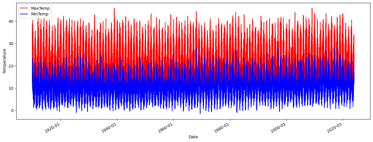
Here is the code that generate it:
import pandas as pd
import matplotlib.pyplot as plt
import matplotlib.dates as mdates

df_max = pd.read_csv('tmax.csv')
df_min = pd.read_csv('tmin.csv')

df_max['Date'] = pd.to_datetime(df_max['Date'], dayfirst=True).dt.to_period('D')
df_min['Date'] = pd.to_datetime(df_min['Date'], dayfirst=True).dt.to_period('D')

# Reset the index
df_max = df_max.reset_index()
df_min = df_min.reset_index()

# Convert Period to datetime
df_max['Date'] = df_max['Date'].dt.to_timestamp()
df_min['Date'] = df_min['Date'].dt.to_timestamp()

# Plotting
plt.figure(figsize=(16,6))
plt.plot(df_max['Date'], df_max['t_max'], color='red', label='MaxTemp')
plt.plot(df_min['Date'], df_min['t_min'], color='blue', label='MinTemp')
plt.legend()
plt.xlabel('Date')
plt.ylabel('Temperature')
plt.gca().xaxis.set_major_formatter(mdates.DateFormatter('%Y-%m'))  # Format dates as 'YYYY-MM'
plt.gcf().autofmt_xdate()  # Slant dates for better readability
plt.show()
No comments to display
No comments to display