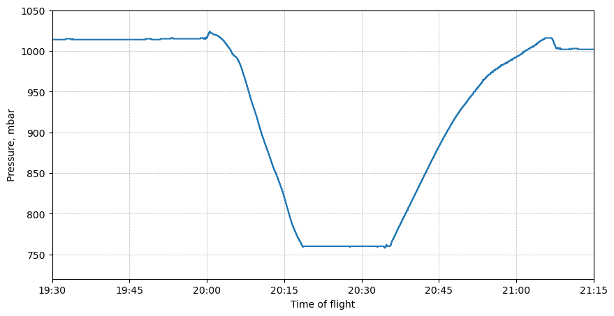
Pressure variation during the flight.
The plot bellow shows the pressure inside the cabin during the flight:
Here is the code:
#Plot pressure
plt.figure(figsize=(10,5))
plt.plot(df.index, df['pres'], label='Pressure')
plt.xlabel('Time of flight')
plt.ylabel('Pressure, mbar')

ax = plt.gca()  # Get the current Axes instance on the current figure
date_format = plt.matplotlib.dates.DateFormatter('%H:%M')  # Set format to hour:minute
ax.xaxis.set_major_formatter(date_format)

# Set x-axis limits to 2023-10-01 19:30 and 2023-10-01 21:15
start_datetime = pd.to_datetime('2022-11-09 19:30', format='%Y-%m-%d %H:%M')
end_datetime = pd.to_datetime('2022-11-09 21:15', format='%Y-%m-%d %H:%M')

ax.set_xlim(start_datetime, end_datetime)
plt.ylim(720,1050)

ax.grid(axis='both', linestyle='--', linewidth=0.5)
plt.show()
No comments to display
No comments to display