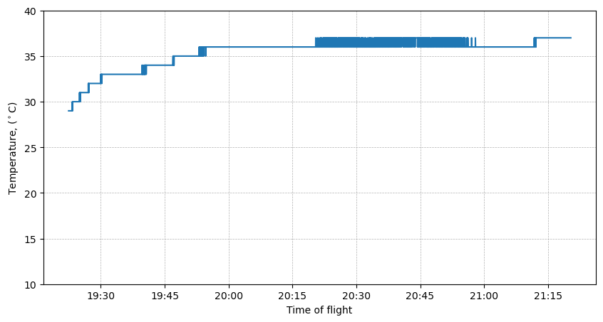
Temperature variation during the flight.
The plot bellow shows the temperature variation:
 The plot was generated using the following code:
# Load the Pandas libraries with alias 'pd'
import pandas as pd
from datetime import datetime
import matplotlib.pyplot as plt


data = pd.read_csv("data_adl2mel.csv", index_col=False, parse_dates=["datetime"])
df = pd.DataFrame(data)

# Set the datetime column as the index
df.set_index('datetime', inplace=True)


#Plot temperature
plt.figure(figsize=(10,5))
plt.plot(df.index, df['temp'], label='Temperature')
plt.xlabel('Time of flight')
plt.ylabel('Temperature, ($^\circ$C)')
ax = plt.gca()  # Get the current Axes instance on the current figure
date_format = plt.matplotlib.dates.DateFormatter('%H:%M')  # Set format to hour:minute
ax.xaxis.set_major_formatter(date_format)
ax.grid(axis='both', linestyle='--', linewidth=0.5)
plt.ylim(10,40)
plt.show()
No comments to display
No comments to display